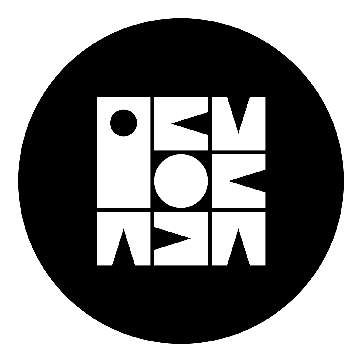
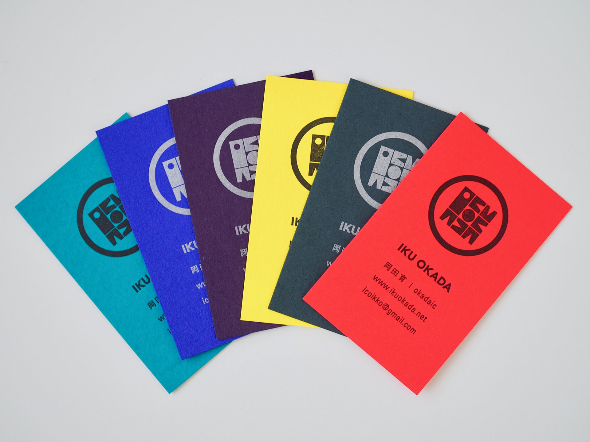
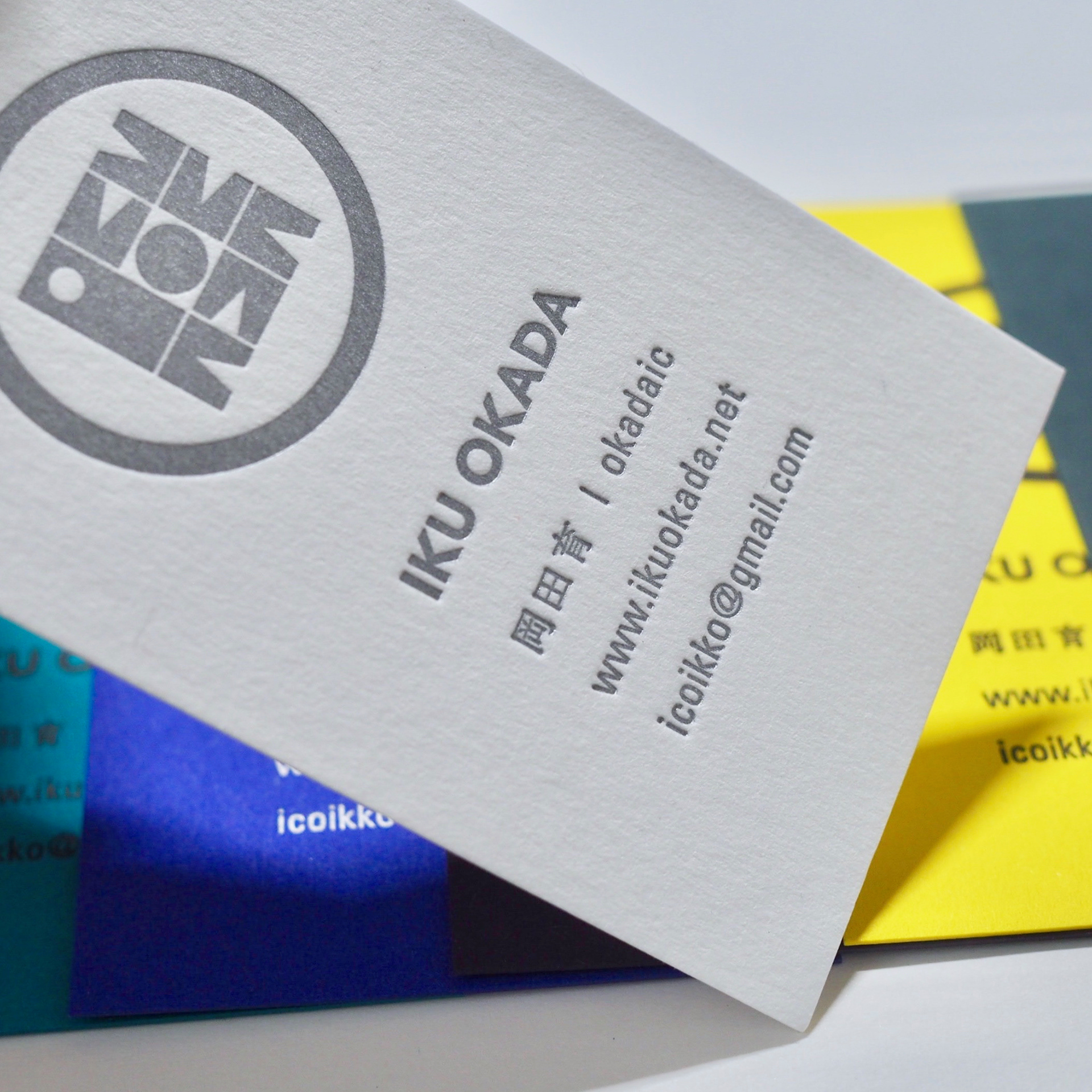
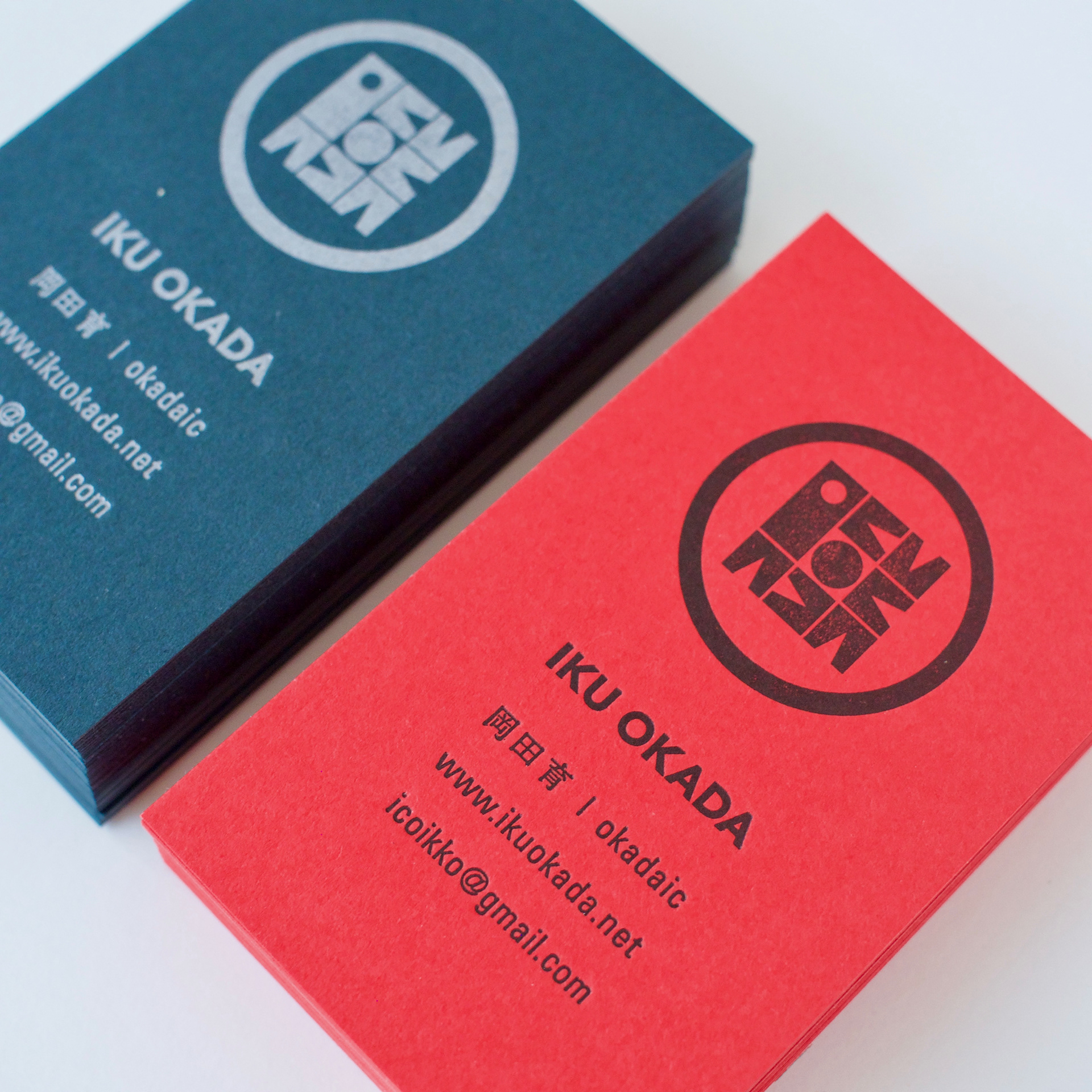
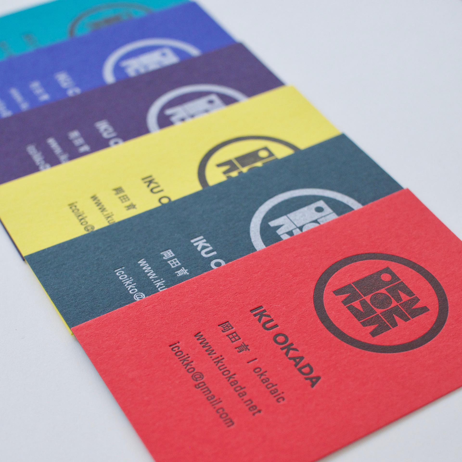
creative design : Iku Okada
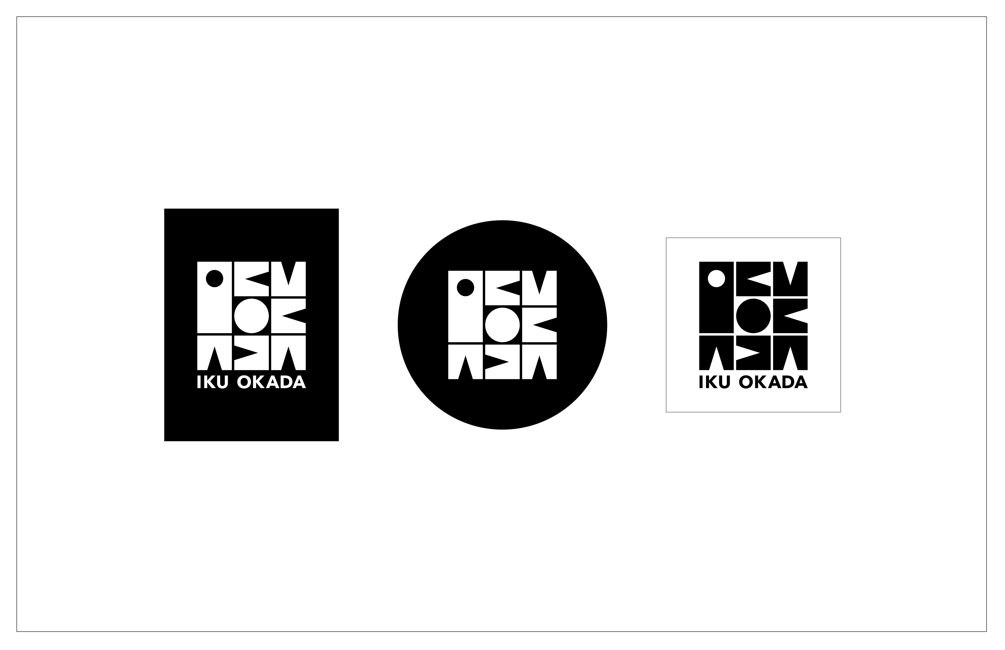
original logo design : Iku Okada
printing : Kamime www.kamime.net
paper : colorplanpapers.com
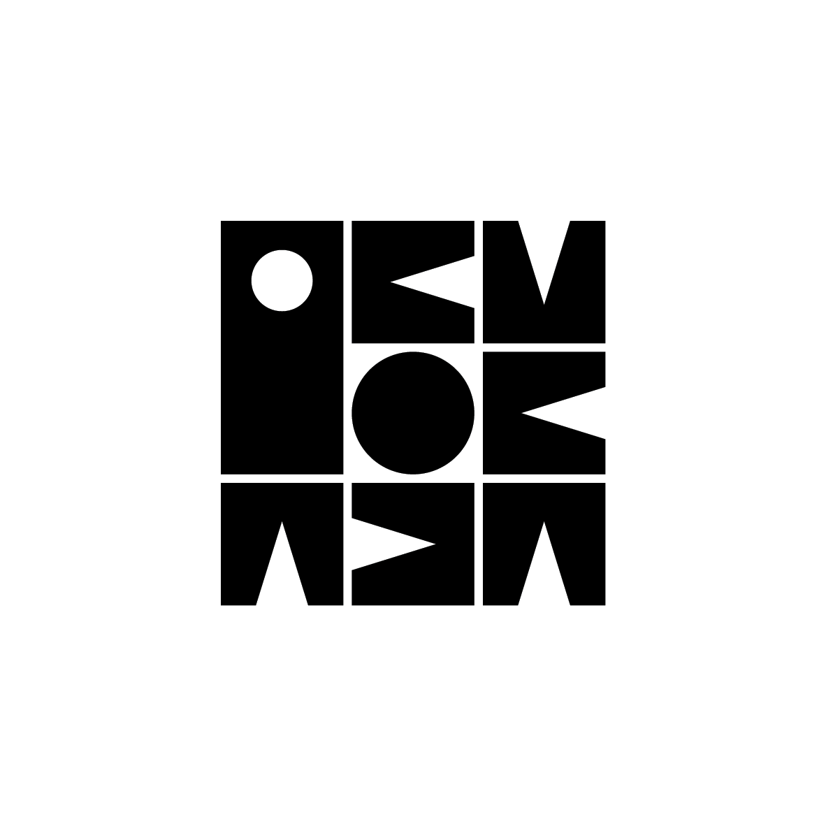
original logo design : Iku Okada
printing : Kamime www.kamime.net
paper : colorplanpapers.com
* * *
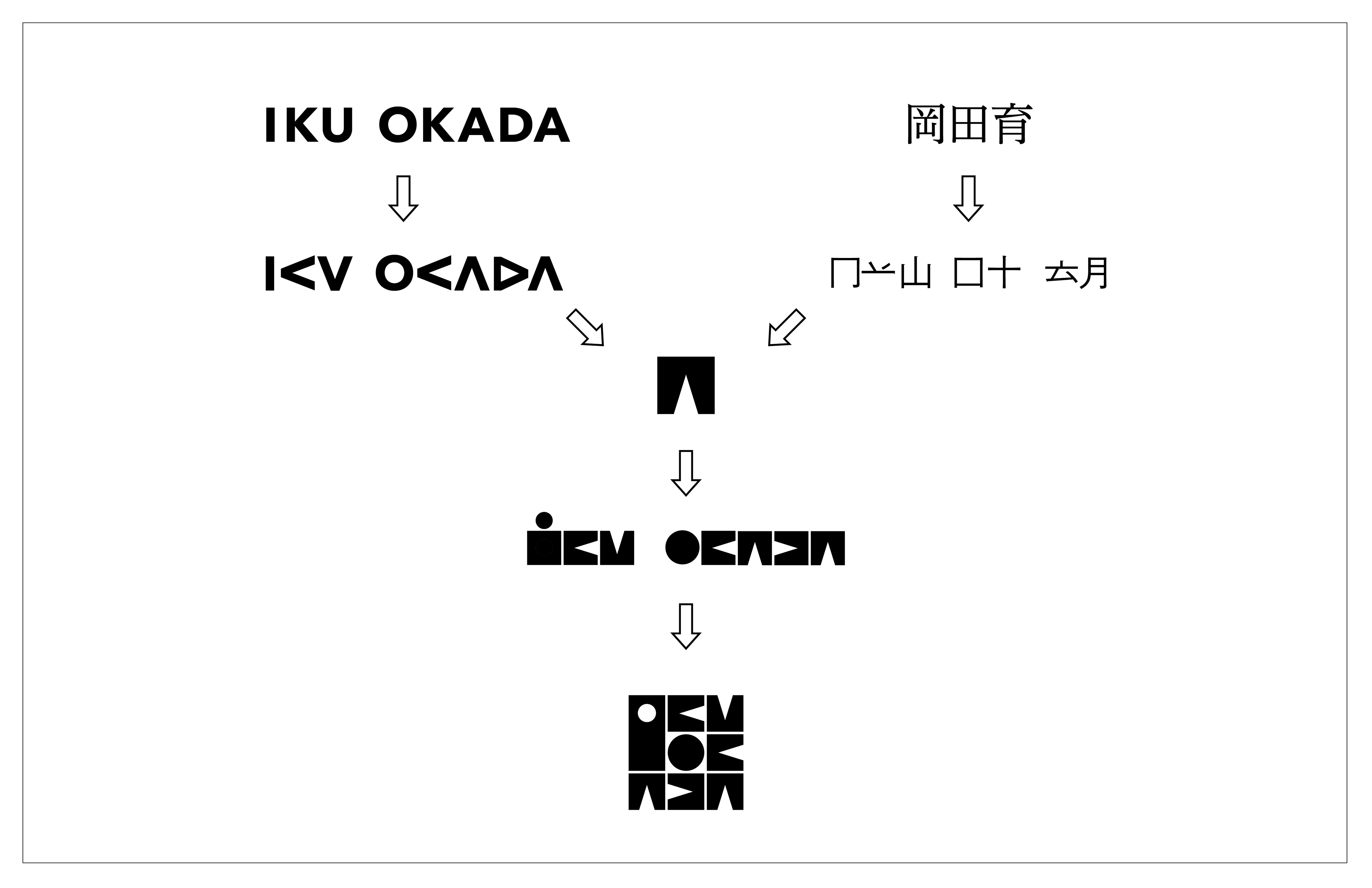
CONCEPT MAKING
IKU OKADA — there are repetitions of ‘K’ and ‘A’, circulations of ‘O’ or ‘D’. Rounded shapes and triangle spaces are eye-catching. Meanwhile, Kanji characters 岡田育 are utmost square-ish and almost line symmetry. I always feel my name quite geometric, and it might have influenced to my design aesthetics. The key aim for this logo is to express all letters with the limited component. Which must be ‘the square with triangle negative space’, serendipitously has a similarity to ‘冂’ of ‘岡’. Another element is ‘two perfect circles’ for my initial letters.